How Colors Shape Your Child’s Emotions and Development: A Parent’s Guide to Using Color Wisely?
Have you ever noticed that your child behaves differently in different rooms? Some parents describe how their baby becomes unusually fussy at their grandparents’ house but instantly calms down at home. Often, it’s not just the noise, smell, or interactions that affect them—it might simply be the color of the room.
One mother once told me: “Every time we visit my parents, my baby starts crying non-stop. But the moment we come home, he lies quietly in his crib.” It turned out that her parents’ bedroom had deep red walls and a dark brown ceiling, while her baby’s room at home was decorated in soft green and white. The contrast in colors explained the difference in behavior.
Color is more than decoration—it’s a powerful psychological tool that affects mood, focus, and even physical development. For adults, colors can influence productivity and emotions. For babies and children, colors can directly impact brain development, sleep quality, and emotional regulation.
0–6 Months: Awakening the Senses with Black, White, and Gray
Newborns’ vision develops gradually. In the first few months, they can only distinguish high-contrast shades—mainly black, white, and gray. According to the American Optometric Association, babies at this age are more responsive to strong contrasts than to bright hues.
At this stage, color isn’t about emotion—it’s about stimulation and perception. High-contrast visuals help strengthen visual pathways and support early brain development.
Color tips for newborns:
Use black-and-white patterned cards, mobiles, and cloth books to attract visual attention.
Hang symmetrical black-and-white decorations above the crib to encourage eye tracking.
Choose soft gray or off-white walls to minimize overstimulation and support sleep.
Opt for simple, monochrome toys instead of overly bright, complex designs.
These early contrasts are a baby’s first artistic introduction to the world—their “first crayons,” so to speak, shaping how they begin to interpret light and form.
6 Months–2 Years: Gentle Pastels for Emotional Security and Joy
Around six months, babies start exploring, crawling, and recognizing faces and emotions. Their color vision expands dramatically, and they begin to form color preferences.
Research suggests that toddlers are drawn to soft yet bright hues such as pale yellow, mint green, and baby blue. These tones stimulate curiosity and comfort without overwhelming the senses. This period marks the beginning of what psychologists call the “emotional coloring stage”—when colors begin to influence mood and attachment.
-Color tips for this stage:
Use light green or sky blue for play and rest areas to promote calmness and security.
Add a touch of orange or light red near eating areas to gently boost appetite.
Keep the nursery soothing with cream, soft gray, or muted pastel shades.
Limit each set of toys to three main colors to reduce visual clutter.
Use natural materials and light wood finishes to create warmth and familiarity.
One mother shared that after painting her baby’s room a soft green, her child began sleeping longer naps and seemed happier playing alone. Subtle environmental changes like these can have surprisingly positive effects.
2–6 Years: Using Color to Guide Focus and Emotional Expression
As children enter the preschool years, their independence grows—and so does their emotional complexity. Colors can now be used not only to soothe but to teach and guide.
A study published in Developmental Psychology found that low-saturation blue-green tones improve concentration in children aged 3–6, while bright reds and intense oranges may cause overstimulation and impulsivity. In this phase, color becomes a subtle tool for emotional education.
-Color tips for preschoolers:
Designate energetic zones (like play areas) with cheerful yet moderate colors such as coral, sky blue, or grass green.
Use warm neutrals like beige, tan, or soft gray in reading corners to encourage focus.
Create a “calm corner” with muted lavender, dusty rose, or sage green where your child can relax or process emotions.
Mix neutral walls with colorful accents (e.g., artwork or storage bins) to maintain balance.
Involve your child in color choices—it helps them express individuality and autonomy.
A parent once described how her four-year-old, who often had tantrums, learned to manage his emotions through a “feelings corner.” The wall was painted light blue, decorated with smiley faces, and filled with cushions of different colors representing emotions. Over time, he learned to retreat there voluntarily when upset—a small but meaningful step toward emotional intelligence.
Color Psychology: What Your Child’s Favorite Color Reveals
Beyond the environment, children’s color preferences can offer a glimpse into their developing personality. The Swiss psychologist Max Lüscher proposed that color choices reflect emotional states and behavioral tendencies. While not definitive, these associations can guide parents in understanding their child’s inner world.
Red: Energetic, passionate, and bold—but too much red can trigger restlessness or aggression.
Yellow: Cheerful and optimistic, encouraging creativity and confidence—but overuse may cause irritability.
Green: Balanced, calm, and stable. Ideal for anxious or easily stressed children.
Blue: Reflective, focused, and reliable. Encourages concentration but excessive blue may feel isolating.
Purple: Imaginative and artistic, often linked to sensitivity and empathy. Too much may lead to moodiness.
Orange: Social and enthusiastic, promoting confidence and playfulness. However, intense orange can overstimulate.
Pink: Gentle, compassionate, and nurturing. Promotes affection but can sometimes feel overly passive.
Gray: Neutral and balanced, though excessive use may dull energy or curiosity.
Black: Suggests independence and depth but may also signal withdrawal if over-preferred.
White: Represents purity and simplicity. In moderation, it enhances light and clarity, but too much can feel sterile.
By noticing which colors your child gravitates toward—in their clothes, drawings, or toys—you can better understand their emotional needs and guide them toward balance.
Avoiding Overstimulation: Finding the Right Balance
While color enriches a child’s world, too many bright or clashing tones can overwhelm their developing senses. Overstimulation may lead to irritability, poor focus, or sleep disruptions.
Tips to prevent color overload:
Stick to a simple palette of two to three main colors per room.
Choose muted, nature-inspired tones over synthetic brights.
Use bold colors strategically—perhaps on one accent wall or in small decorative items.
Pay attention to your child’s reactions. If they seem restless or anxious in a room, consider softening the tones.
Balance colorful environments with plenty of natural textures like wood, cotton, and linen.
Moderation is key: the goal is not to eliminate color, but to use it intentionally—to support calmness, curiosity, and comfort.
The Emotional Language of Color:
Children don’t always have the words to express how they feel—but color gives them a voice. By linking colors to emotions, parents can help children build emotional literacy from an early age.
Try creating a simple “emotion chart” with your child:
Yellow for happiness;
Blue for sadness;
Red for anger;
Green for calm;
Purple for imagination;
Encourage your child to point to or color the emotion that matches how they feel. This helps them recognize, label, and manage emotions—skills that form the foundation of empathy and self-regulation.
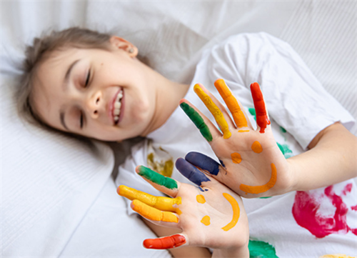
Art can also serve as emotional expression. Providing crayons, paints, or colored clay lets children project inner feelings safely and creatively.
The Deeper Connection: Parents’ Emotions Reflected in Home Colors
A home’s color palette often mirrors the emotional atmosphere of the family. Gentle, harmonious colors express warmth and stability—qualities every child needs to thrive. A soft blue can echo calm parenting energy; a balanced green can reflect emotional harmony.
Children are deeply attuned to their parents’ moods. The colors surrounding them silently communicate security, patience, and love—or, conversely, tension and chaos. When parents choose colors thoughtfully, they are also creating emotional consistency.
Color, though silent, speaks directly to the heart. It flows through a child’s eyes into their emotions, shaping how they experience safety, joy, and belonging.
From the black-and-white contrasts of infancy to the expressive palettes of preschool, color accompanies every stage of childhood. It influences not only how children see the world but how they feel within it.
By understanding color psychology, parents can do more than decorate—they can nurture emotional balance, boost focus, and create spaces that grow with their child’s spirit.
Recommend for you:
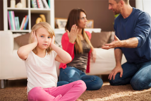
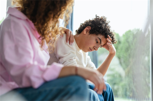
Healing Broken Parent-Child Relationships
It often begins quietly—a slammed door, a cold look, a curt response. Many parents recognize these signs, especially when raising teenagers.
Why Free Time Is Crucial for Developing Creativity?
In a world that seems busier than ever, children’s days are often packed from morning to night—school, sports, homework, music lessons, language classes, and maybe a few minutes of screen time squeezed in before bed.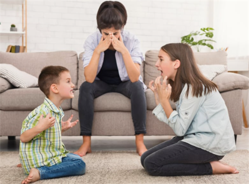
Sibling Rivalry: From Fighting to Friendship
Sibling rivalry can feel endless, and sometimes, it leaves you wondering if your kids will ever get along.
The universally recognized parenting model: nurturing outstanding children
Across the globe, parents adopt different approaches to raising children, but research in developmental psychology highlights that some methods are consistently more effective in nurturing well-rounded, resilient, and successful individuals.